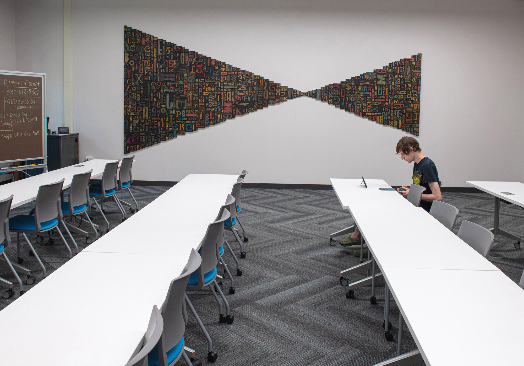
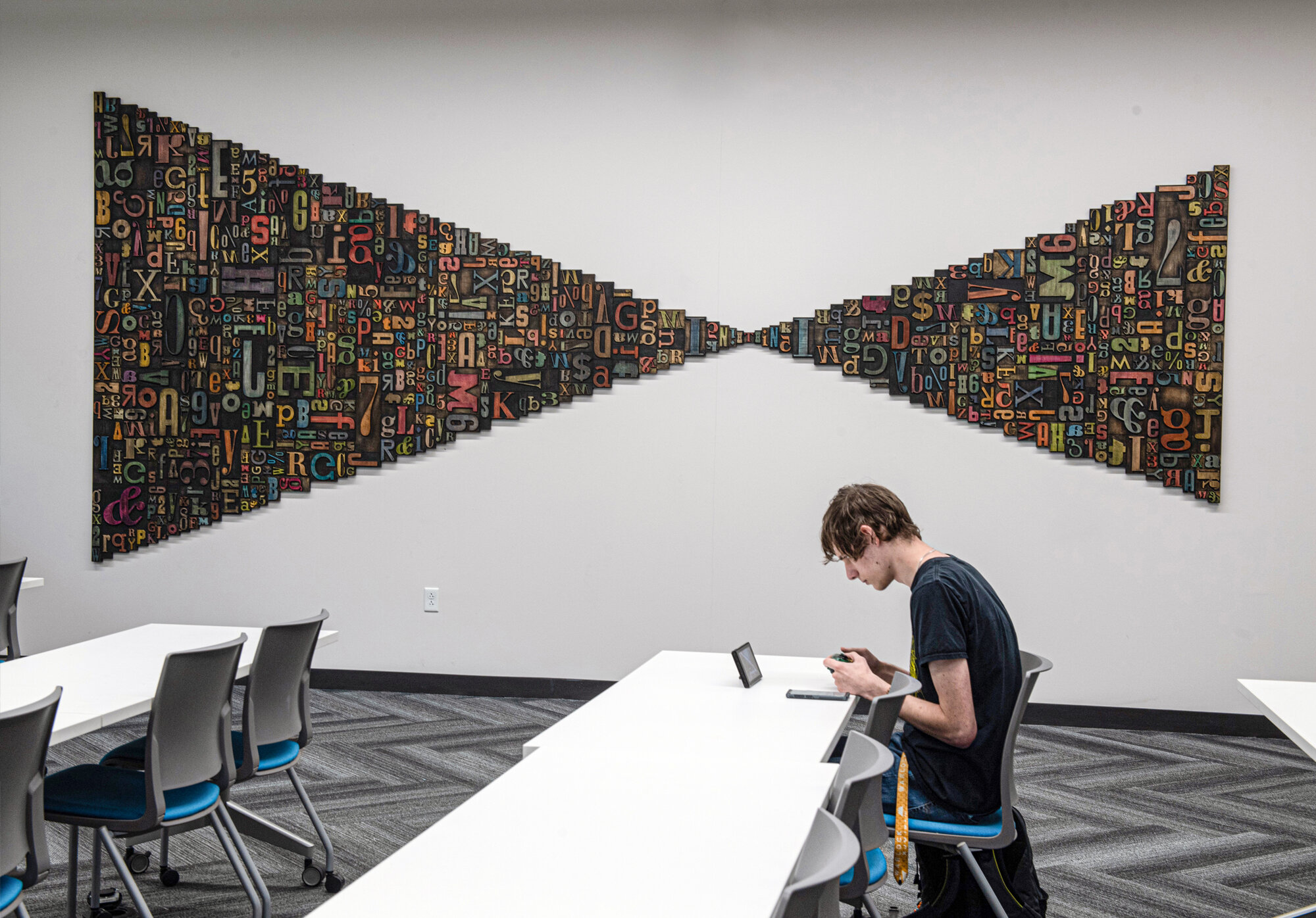
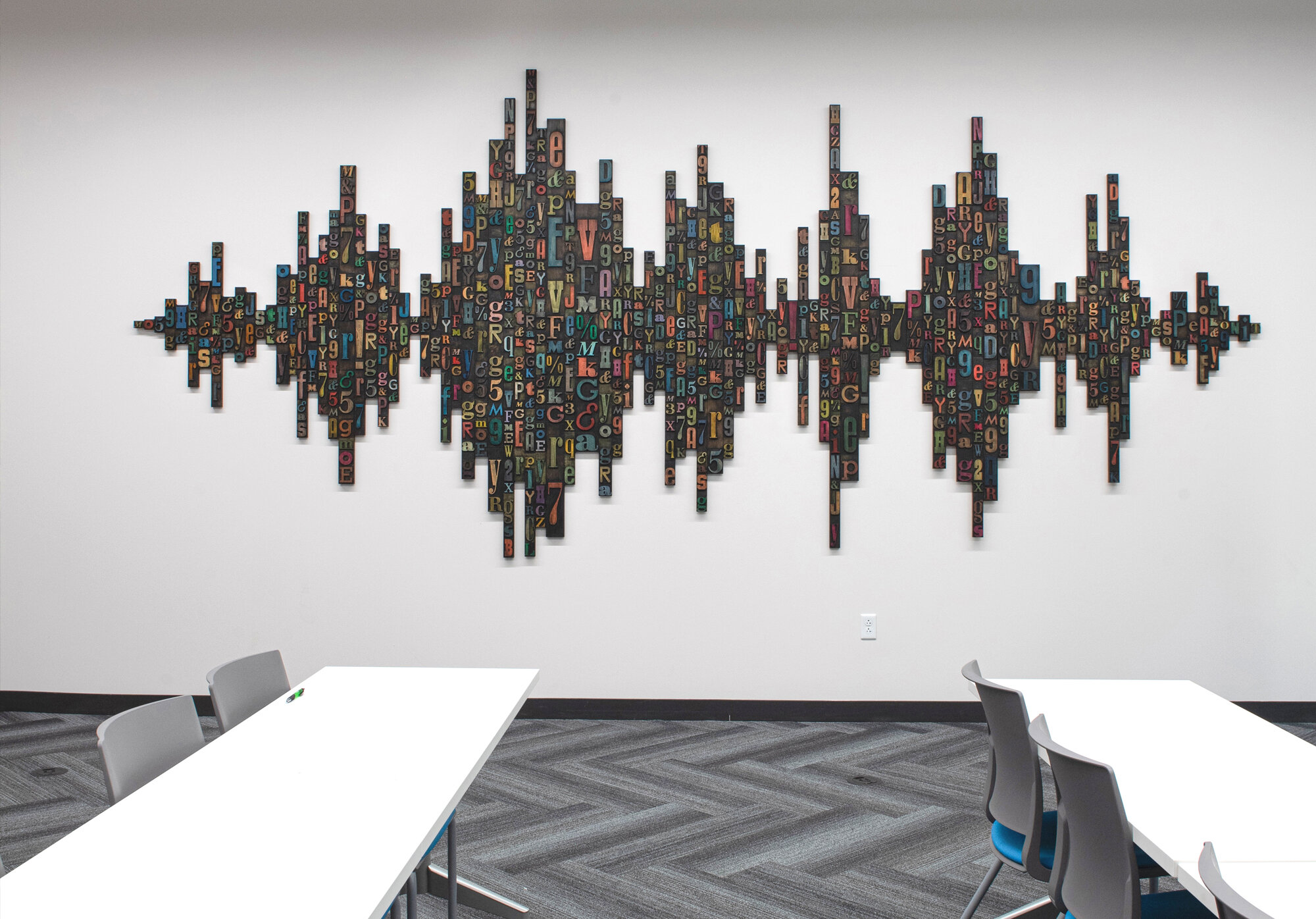
SPEAK ON IT & THINKING MADE VISIBLE
Kent State University, Taylor Hall, Communications & Visual Communications
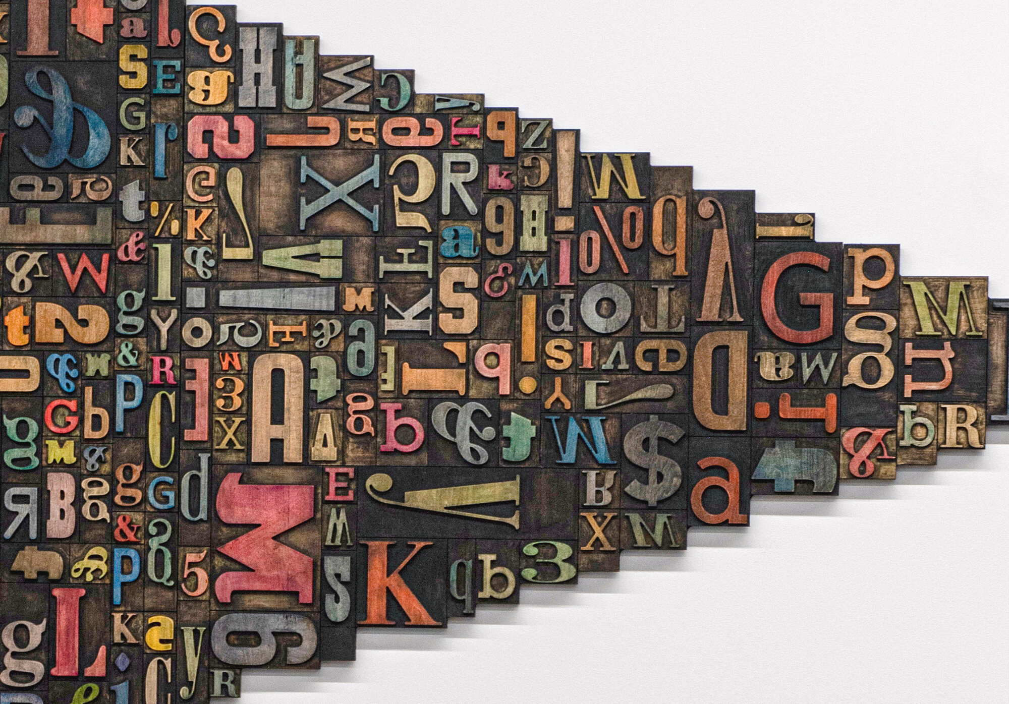
A composition of color-stained wood letters representing movable type printing, a process leading to the democratization of knowledge, Thinking Made Visible and Speak On It symbolize this immeasurable contribution to human history.
Although wood letterforms date back to the first known Chinese wood block print from 868 BC, Johannes Gutenberg is credited with the development of modern movable type printing. Early prototypes used wood letters and evolved into cast, reusable metal letters, around 1440. The Gutenberg press caused nothing less than a cultural revolution as it facilitated the wide circulation of ideas and literature, introducing the era of mass communication. The rapidity of typographical text production led to the issuing of the first newspapers which opened up an entirely new field for conveying up-to-date information to the public. This sudden widespread dissemination of printed works - books, tracts, posters and papers - gave direct rise to the European Renaissance. In the U.S., the first known wood type catalog was published in the early 1800s, several years before the expansion of the commercial printing industry. At which point, wood type made a resurgence as printers found that larger type was required for newspaper headlines and advertising and wood was the logical material. However, with the advent of digital technologies, movable type became an antiquated process.
Today, letterpress printing is in a full revival, reflecting an expression of a society demanding artisanal, one-of-a-kind goods in an era of endless, identical reproduction. Beneath the vintage patina of letterpress goods is a digital reinvention that elevates Gutenberg’s great creation into the full embrace of modern technology. It is with CNC technology that the wood letters composing Thinking Made Visible and Speak On It are fabricated, conflating the resolve of mass communication and evolving methodologies.
Representing the visual communications program, the title Thinking Made Visible is derived from legendary graphic designer Saul Bass’s quote “design is thinking made visual.” The asymmetric geometry takes its form from a diagram of light entering an eye, whereby a depicted ray of light passes through the curved retina bending the light creating an upside down image that the brain reinterprets correctly. Not only is this how we form images in our mind, it is also a graphic visualization of the process. Composed of various sized letters, all with a history to reveal, they are rotated and pieced together like a puzzle communicating pure form.
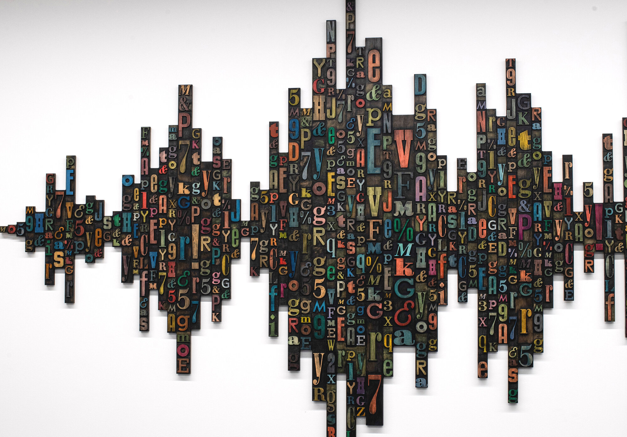
Characterizing the core of the communications department, Speak On It visually depicts audio sound waves composed of vertically stacked columns of wood type. The formal columns rise and fall as the letters appear to be in continuous motion, creating a visual rhythm of voices.
Design Optimization/Project Management: Protolab HTX
Collaborator: HTXmade